
![]() Many of the titles shipped with Apple Final Cut Pro are pretty, um, suboptimal. They ignore Safe Zones, the font choices are clunky, text is hard to read, or the backgrounds can’t be adjusted.
Many of the titles shipped with Apple Final Cut Pro are pretty, um, suboptimal. They ignore Safe Zones, the font choices are clunky, text is hard to read, or the backgrounds can’t be adjusted.
It is easy to look at many of them and decide to write the whole collection off as useless. However, what you see is not necessarily what you can get. There are ways to adjust titles in Final Cut that provide far more than you might expect.
You are probably familiar with how to modify and adjust text in the Inspector. But there is far more that we can do. Let me give you three examples.
MAKE BACKGROUNDS TRANSPARENT

Here’s our first example: Soft Bar. The text does not respect Safe Zones (indicated by the faint yellow lines) and the opacity of the background can’t be adjusted.

With the text clip selected in the Timeline, go to Inspector > Text Animation (red arrow). While we can adjust font choice, color and size, we can’t change the position of the text to decrease vertical line spacing, better fit within Safe Zones or make the background more transparent.

Control-click the title in the Titles Browser (not the timeline) and choose Open a Copy in Motion. This makes a copy of the title and opens the copy in Motion.
In Motion, you can adjust the size, position and default font for the text. (While you can change the size and font in Final Cut, you can’t change the position.) For this example, I’ll bring the text lower to match the Safe Zones.

In Motion, select the Background group, this contains the solid color background. Go to Inspector > Properties and change the Opacity to something less dense. Here, I used 60%.
More importantly, right-click the arrow to the right of Opacity (red arrow) and select Publish. This allows Final Cut to control the Opacity setting, as you’ll see shortly.
Save the project.
NOTE: If you choose Save the Original, which I generally recommend, this updates the copy in the Titles Browser. If you Save the Duplicate, it creates a duplicate of the copy and saves it using the name and location you specify. Since you are working with a copy, you are generally fine selecting Save the Original. Final Cut works well with either option.

Now, when you apply this title in Final Cut to a clip in the timeline and select the clip, a new setting – Opacity – appears in the Title Animation Inspector. The default setting (60 in this case) is the setting for this parameter in Motion when you saved the clip.

The title looks better!
IMPROVE READABILITY

Here’s another problem child: Organic. The text is impossible to read, the background isn’t transparent, the green leafy twirls are essentially invisible, and the text does not honor Safe Zones.
Again, right-click on the title in the Titles Browser and Open a Copy in Motion. A copy opens in Motion so we can make changes.

As you can see from the Layers pane, this is a more complex project to “fix,” but we can still improve things.
First, adjust the position of the text so it sits on Action Safe.
As we did in the previous example, select the group OrganicBG, which contains the background, reduce the Opacity to 50% and Publish the control so Final Cut can adjust it later.
The two green “twirls” are a series of nested and masked effects. While we could get deep into the nitty-gritty and change these, it is easier to apply a simpler correction.
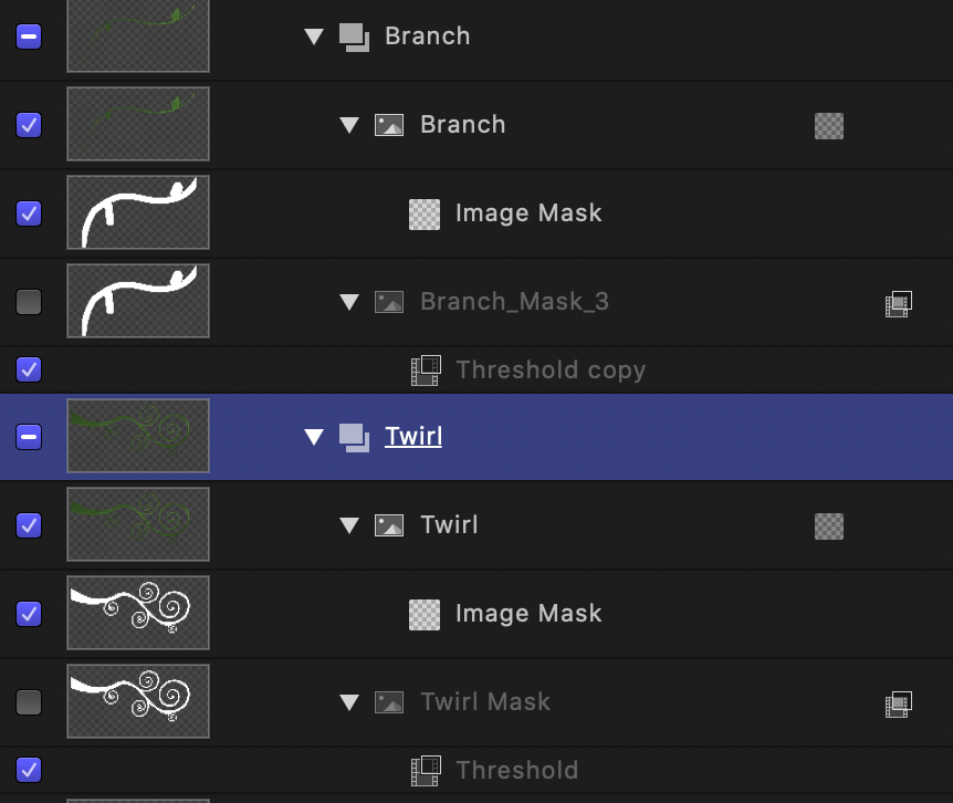
Select the Twirl group and apply Filters > Color > Colorize filter. This changes the color of everything in that group, which is the leafy stuff on the right.

In Inspector > Filters, use Remap Black To and set the color to something lighter, so it can be better seen against the background. I used a pale yellow. Then, match that color in Remap White To.
NOTE: If you don’t match the colors, you’ll end up with some strange edges.
Finally, Option-drag the Colorize filter and drop it on top of the Branch group. Option-dragging duplicates the setting and changes the color of both leaf patterns to something more visible, yet still in keeping with the background.
Finally, set the Opacity for both Branch and Twirl groups to 50%. We don’t need to publish this, since we just want to make these twirls visible, not adjustable.

Here’s the finished result, with Safe Zones displayed in Motion. Save your work, then, when you apply the copy in Final Cut, it will reflect your changes.
IMPROVE TEXT ANIMATION
Many of the titles in Final Cut using Fade In/Fade Out for animation. This isn’t bad – and in many cases it is preferred – but, when we need to dive into the deep end, there are a LOT more text animation options in Motion.

For instance. take Energetic. These letters lean like they are waking up from a nap. Hardly energetic at all.
NOTE: “Sammath Naur” is from Tolkien’s “Lord of the Rings.” It seemed appropriate given the background.

If you are in a hurry, you could select the title in the timeline, then go to the Title Animation Inspector (top red arrow) and change the Build In (animate the In) or Build Out (animate the Out) settings (bottom red arrow) to different animations. Many titles allow you to change the animation in the Inspector.
But, let’s say we want to go even more over the top. As before, control-click the Energetic title in the Titles Browser and select Open a Copy in Motion.

Twirl down the Text settings in the Layers pane and delete all the animations applied to the title text.
NOTE: You don’t need to do this, you could just unselect them. But, since this is a copy, there’s no harm in doing so.
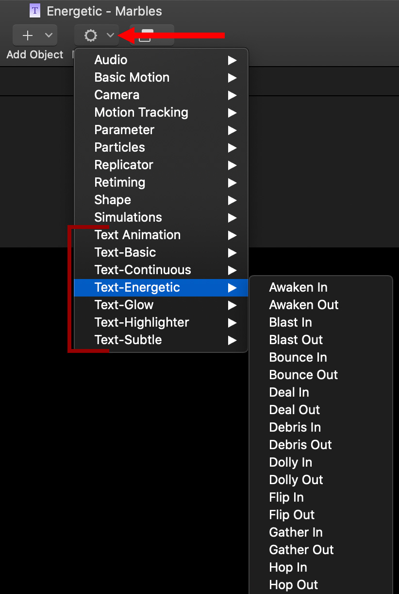
In the Behaviors menu, there are almost 200 text animations to choose from (indicated by the red bracket). Those whose titles end in “In” have the text animate into the frame. Those whose titles end in “Out” have the text animate out of the frame.
In this case, I want the text to animate in, then remain on the screen so I can dissolve out at the end.
NOTE: I like text that makes a big entrance, then quietly disappears at the end.

Apply the Behaviors > Text-Energetic > Marbles In behavior.
Save your work and switch back to Final Cut.

Here’s the finished animation in progress. In Final Cut, I changed the font (Cracked) and the text, added a dark red shadow and changed its direction to better represent the angle of light in the shot.
SUMMARY

While at first blush, many of the titles in Final Cut are pretty appalling, once you look more closely at the options in the Title Animation Inspector, or actually change them in Motion, you can end up with some pretty cool looking text.

2 Responses to Text Tricks and Techniques in Apple Final Cut Pro
Hi Larry,
In the “Organic” example, one saved to Final Cut, I am unable to shift the position of the text on either the X or Y axis. Nor am I able to “publish” those controls in Motion. Is that because the text is part of a widget?
Thanks,
Philip
Philip:
Text position is controlled from inside Motion. For Organic, select the layer entitled “Title Text with mask.” You can then adjust position using the Inspector. (Just tried this and it works.)
However, you are correct. You can’t publish the position, like you can opacity, because the position is controlled by a widget.
Larry