 Last week’s article on effects in Final Cut was so well-received, I decided to take a closer look at a specific effects category that you may not have had time to explore: Lights.
Here’s what these effects look like. (Drag any image to your desktop to see a larger view.)
ARTIFACTS

Artifacts add “sunspots.” These are useful when shooting a backlit subject. However, these move very quickly so they will work best when the camera is handheld and moving. Be sure to decrease Opacity. In this example, I also changed Color, Position and Blur Amount.
This effect is useful, but the excessive speed of this effect switching between the four artifact presets detracts from the overall result. It’s fine for stills, but not for video.
AURA

Aura adds a hard, color outline to the edges of objects. This effect is an acquired taste. I haven’t acquired it yet.
BLOOM

Bloom increases saturation and edge contrast. Keyframing either Amount or Threshold can create surreal effects, for example, simulating a drug state or fainting.
BOKEH RANDOM

This is a really useful effect to add life to backlit subjects. Though, like many of Apple’s animations, this moves far too fast. Also, a bokeh is created by light bouncing off the inside of a lens. This means that if the lens doesn’t move, the bokeh shouldn’t move either.
However, there’s no way to “freeze” this effect. Which means that this will look most believable when the subject or camera are moving. I adjusted Type, Size, Pattern and Speed.
DAZZLE

(Yarra River image courtesy of Leigh Reeves.)
This works best at night with sharp light sources. The effect is, ah, dazzling! The default settings are too aggressive. This looks better when you reduce Amount.
FLASHING / INTRO FLASHES / QUICK FLASHES/SPIN

Flashing animates the Bloom effect, simulating artillery or lightning strikes, or, perhaps, drug flashbacks. Or flashbacks in general. Again, the settings are too intense, cut Intensity in half.
Intro Flashes does the same thing, but adds a zoom in effect. Quick Flashes/Spin goes one step further zooming in and rotating the image. As with Flashing, decreasing the settings may help better sell the effect.
GLOW

(Yarra River image courtesy of Leigh Reeves.)
Glow is really a nice effect to add a gentle glow to bright objects in the frame. More subtle and prettier than Bloom. It works best for night shots, or where there are obvious highlights in the frame. This is one effect where I don’t change the default settings.
HIGHLIGHTS

Highlights is another effect which moves too fast. It should more accurately be called “Edge Damage,” as it simulates the edges of undeveloped film getting exposed to light. Bring Intensity way down on this. You can change color temperature, but Warm is far too orange and Cool is far too blue. This might be useful simulating viewing old film or home movies.
SHADOWS

(Image courtesy of EditStock.com)
Shadows is a good idea very poorly implemented. It gives the effect of a light, like the sun, shining through blinds. (Lighting folks call this a “gobo.”) However, while you can change its rotation, you can’t change its position or size. Nor can you change the four options for casting shadows.
There are far, far, FAR better 3rd-party effects for this than tearing your hair out using this.
SPOT

For me, Spot is the most useful effect in this category. It highlights an area of the frame. This is a fast way to compensate for a face that’s too dark, or brighten an object. It works by dimming the area outside the spot and brightening the area inside the spot. I generally adjust Feathering and Contrast.
This is a worthwhile effect to add to your toolkit.
STREAKS

Streaks adds blue streaks across the frame. Like many of these effects, the default settings are excessive. A nice way to animate this is to add keyframes to the Angle. Also, lower Amount, Thickness, and Glow; then adjust Variation. You can also adjust Color, but I didn’t in this example. This is not animated by default.
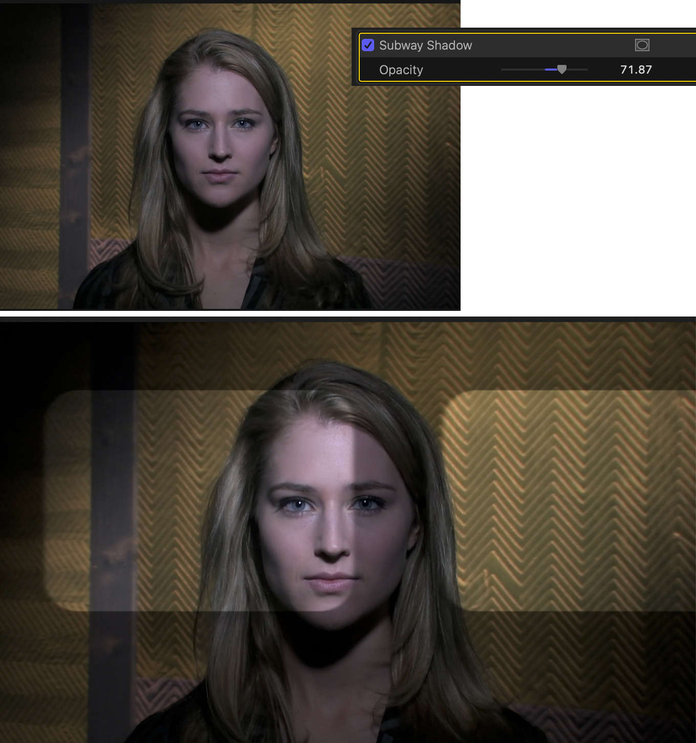
SUBWAY SHADOWS

Subway is another good idea done wrong. It simulates train window lights flashing past. But, you can’t change speed, position, size or direction. Or color, for that matter. I’m sure there’s a use for this. But not likely.
SUMMARY
There are two key takeaways: Virtually every effect can be improved by adjusting its settings; and not all effects are equally useful. Feel free to play with these and see if and how they can improve your projects.
One Response to Light Effects in Apple Final Cut Pro
Those shots by Reeves are amazing!!!