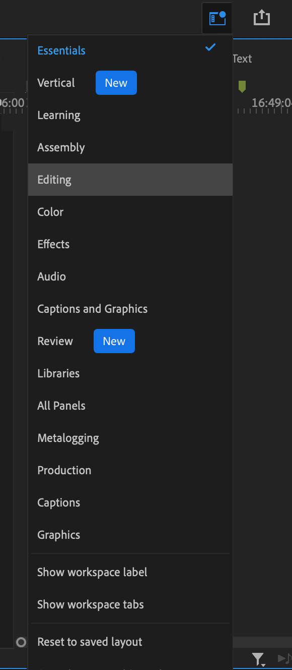
 One of the significant new features in the June, 2022, update to Premiere Pro are changes to workspaces.
Three new options were added:
NEW ESSENTIALS WORKSPACE
The new Essentials workspace optimizes Premiere to run on a single screen, specifically, laptops. Rather than switching between workspaces, the most important panels are now gathered in one spot, with room for a larger timeline.

In the top left corner are all project and bin panels, along with Effects, Frame.io (which first appeared in the May, 2022 update), and Libraries panels.
NOTE: Above those are the three new workflow screens: Import, Edit and Export.

In the top right corner are Effect Controls, Lumetri Color, Essential Graphics, Essential Sound and Text (which also include Captions).
What I like about this new arrangement is that we can now easily see the Effects, Effect Controls and Program Monitor in the same workspace.

However, though Essentials has much of what we need for a day-to-day edit, in the top right corner, under the Workspace icon, are all the other workspaces that we use with Premiere.
I’ve only been using this new workspace for a short time, but I appreciate how much easier it is to access key panels, plus the new, wider, timeline is a big help.
NEW VERTICAL WORKSPACE
There’s also a new vertical workspace, specifically for working with video media. While the layout of the panels is the same, the program monitor now has much more room to work, at the expense of a narrower timeline.
5 Responses to New Workspaces in Adobe Premiere Pro 22.5
Hi Larry, I prefer working with 2 monitors – How can I continue to edit with a source monitor next to the editing monitor? Thank you. Gloria Messer (212) 355-0814
Gloria:
The same as always. You are not forced to use the new workspace.
Continue using the workspace you’ve been using – and both monitors will work fine.
Larry
Hey Larry
One thing that I don’t like about the new panels is actually the export panel…previously (and in any other software) when you click on the file name, it goes to the place where you want to export and because I export lots of different versions (and long names) I normally just select any other exported name and the software grab that name and I can easily change a few characters and done…now you can not do that because you have “location” separated from the name so I basically need to write the long name every time I want to export it…simple but very annoying thing…thanks!
Hi Larry. I’d be very keen to hear your thoughts on the new export window. It requires a lot more clicking and things that were intuitive and easy access are now hidden. It’s getting a lot of hate on the Adobe forum, however Adobe seem bent on pretty much ignoring that.
https://adobe-video.uservoice.com/forums/911233-premiere-pro/suggestions/45062362-the-new-export-screen-is-clumsy-bulky-and-requir
Pete:
Here’s an article I wrote about it:
https://larryjordan.com/articles/the-new-export-interface-in-adobe-premiere-pro-22-3/
I basically like it. I like how it flows from left to right. It opens up the compression settings to make them more visible and you can quickly and easily export multiple versions of the same project by simply clicking the mouse.
Larry