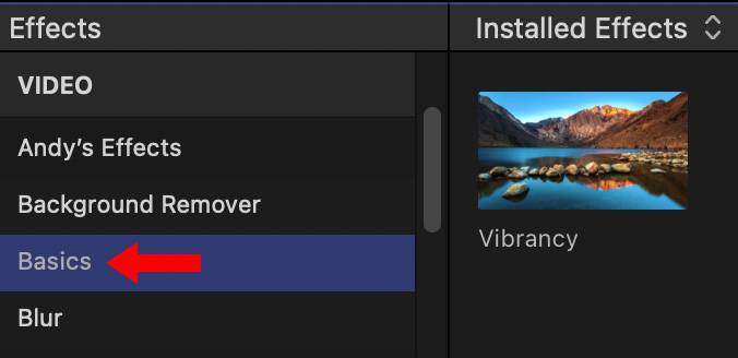
 Apple Final Cut Pro provides saturation control in the Color Inspector and a Vibrancy effect in the Effects panel.

The Lumetri Color panel in Adobe Premiere Pro includes color adjustments for both saturation and vibrance.

What’s the difference between these and which should you use?
At the risk of starting yet more flame wars, here are three general guidelines:
Here are some examples.

Here is a test strip of colors created in Photoshop. The top image is the original, the middle image is with saturation fully off, the bottom is with vibrance fully off.
As you can see, saturation fully removes all colors evenly. Vibrance removes more blues, greens and reds. It is impossible to remove all colors using vibrance.
In general, you should not use vibrance to remove colors.
The value of using vibrance appears as you boost colors to make them more eye-popping when there are people in the shot.
With the overly saturated image, notice how skin tones are too intense and artificial; like a can of spray tan gone wild.
Vibrance enhances colors, without significantly boosting skin tones. Yes, these settings are too high, but, even too high, vibrance still looks “pretty good.”
Here’s a more realistic example, where neither saturation nor vibrance are cranked full.
Both saturation and vibrance boosts the colors in the flower and food. But, see how the skin tones are controlled with vibrance but way too excessive with saturation.
SUMMARY
In general, we can desaturate images any amount without problems. But boosting color can very quickly lead to unpleasant results.
3 Responses to Saturation vs. Vibrance. What’s the Difference for Video?
Larry,
There is a Vibrancy setting in the Effects category of the Inspector in Apple Final Cut Pro. It seems to enhance the image in the way you talk about here.
Philip
Philip:
Thanks for pointing this out – I’ve corrected my article.
Larry
Great tip, very helpful.