 Recently, I was exploring Premiere Pro looking for something to write, when I started experimenting, again, with blend modes.
You are probably familiar with using blend modes to add texture to white text. But, what you may not know is that images get even more interesting when color gets involved.
Here are some idea to expand your creative thinking.
GRAYSCALE TEXTURES

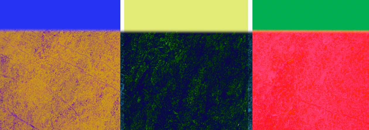
There are three colors in this graphic, which I created in Photoshop:
NOTE: The grayscale values are important, because most blend modes are affected by grayscale, not color.

I’m using this slate image for texture.

Here are the results using Linear Burn. (The original, unmodified, image is on top.) All the colors are darker, but the lightest grayscale shows the greatest amount of texture.

This is Linear Light. Here, the grayscale value nearest 50% shows the greatest amount of texture. And the colors are much less modified than with Linear Burn.

This is Overlay, which uses values from mid-tone pixels. This adds texture across all grayscales, though lighter grayscales reflect the greatest range.
The key point here is that blend mode results vary based upon the grayscale value of the top clip. Blend modes in the Multiply category affect darker pixels, Overlay category blend modes affect mid-tones, and Screen category blend modes affect highlights the most.
TEXTURES WITH COLOR

Let’s change the background for something with a bit more color, like this.

This is Multiply, which uses grayscale values from the darker pixels. Colors are darker, textures are more pronounced, but we don’t see any affect from the color of the background EXCEPT in the white stripes, where the color shows through.

This is Difference, which inverts the foreground colors based upon the background. Darker or lighter grayscale values are more affected than mid-tones.

This is Subtract, which displays the color 180° opposite the top clip. Difference is similar, but not as stark as Subtract. Note that the darker the top clip, the more pronounced the effect.

This is Divide. Even more wacky than Subtract. However, strange as this is, this blend mode has value in color correcting wildly out-of-balance images.
NOTE: Here’s an article that explains how to use Divide for color correction. It’s amazing!
IMPROVE LANDSCAPES
Let’s take our exploration of blend modes one step further and watch what happens as we apply gradients to landscapes.

Here’s the original scene.

Here, a grayscale gradient, using an Overlay blend mode, enhances the clouds by making them darker, while lightening the foreground.
NOTE: You can adjust the amount of foreground lightening by shading the gradient from dark gray to medium gray. The closer the gradient gets to white, the brighter the foreground becomes.

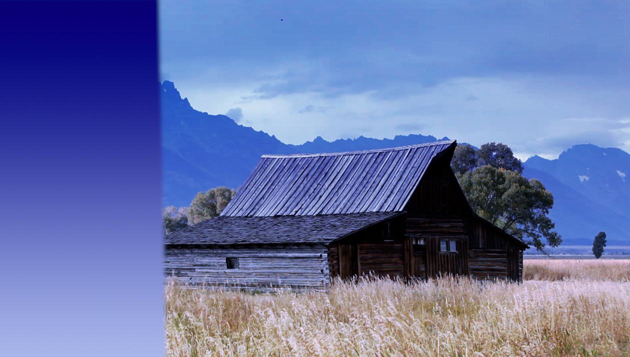
Compare the grayscale to one shading from dark to light blue, again with using an Overlay blend mode. Almost a day-for-night feel, with a foreboding sense of sky.

This option uses a warm gradient, though still shading from dark to light. (Note how this canceled out all the blue color in the sky.) Again, this uses the Overlay blend mode, but the emphasis is on the bursting ripeness of the grain in the foreground.

This is one of my favorites – dark blue shading to medium gold; again using Overlay. This enhances the sky, and keeps the blue color, while ripening the wheat without making it look like it is likely to explode as you harvest it. Plus, the barn, in the middle, has almost a neutral color.
FIX AN EXPOSURE PROBLEM

One more example, this is a shot with an overexposed sky and background (shot in Rec. 709) and an underexposed foreground.

This time, I applied a black-and-white gradient with a very narrow edge, then aligned it with the overexposure. Using Overlay, the dark portion of the gradient darkens the over-exposure, while the lighter portion brightens the foreground.
NOTE: As a bonus, use a mask to make the barn appear a bit less, ah, burned.
SUMMARY
Blend modes, especially using colors and gradients, provide a wealth of effects that are easy to apply and modify to enhance our scenes in unusual ways.