 I could be accused of watching too many football promos, but I got to thinking: “Hey, I can do that.” So, having some spare time this week, here is a cool 3D camera technique you can use whenever you need some dramatic text for a promo or an open.
Unlike most elements in Motion, 3D text is actually 3D. This means we can move a camera into and around the text, which is what we will do here.
NOTE: There are about two bajillion ways to do things in Motion. This is one way, you are welcome to build on this and discover your own.

Here’s where we are going. And, at the end of this tutorial, I have the Motion project file and exported movie so you can see what I did. If you exclude giggling, this took me about 45 minutes to create.
GET STARTED
Create a new Motion project. Mine has a 12 second duration, yours should match whatever music you want to use.

Next, I like to organize my projects into Groups so that I don’t get lost with all the details. Here, I’ve created three Groups: Background, Text, and Flare. (They are grayed back because there is nothing in them.)
ADD AUDIO

I always find it helpful to add the audio first, then animate to match the music. To do so:
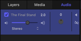
You manage and adjust the file using the Audio tab, not the Layers tab. In this case, I just need the gain increased by 2 dB.
Motion has VERY limited audio controls. I strongly recommend creating finished audio before importing the clip into Motion.
NOTE: The audio file is from Smartsound, it is included in my movie, but not the Motion project download, because I don’t have permission to distribute the audio file separately. You can use your own music, or none, as you see fit.
CREATE THE TEXT
One of the big benefits of using Motion is its ability to quickly create, format and texture 3D text. You have lots of options here, feel free to play with settings to discover how they change the look.

At the bottom of the Viewer, select the 3D Text tool.

Select the Text group and type some text. Here, I created two different text elements, because I want to animate them separately. You can use different words, the technique applies everywhere.
NOTE: When starting a project, I always display Safe Zones. First, because it reminds me where the actual frame is, amidst all the gray. Second, it makes sure I keep my text inside these essential boundaries. (View > Overlays > Safe Zones)

Using Inspector > Text > Format set the font and size to match the screen here.

Using Inspector > Text > Appearance, set both sets of text to the following:
Further down in the same panel, set:

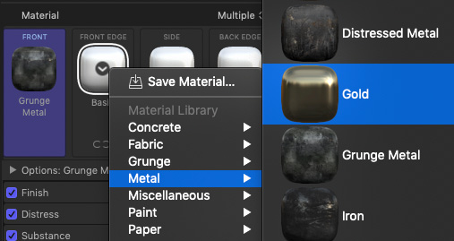
Set the Material pop-up menu to Multiple. Then, texturize the text using any settings you want.

What I used was for both text clips were:

Here’s what it looks like so far. It’s dark because we turned off most of the lights.
ADD NEW LIGHTS
There is no limit to the number, color, position or animation of lights. So, to keep this simple, I’m only going to add two: a point light and a spot light.
Choose Object > New Light. Motion will ask if you want to go to 3D. Click the Switch to 3D button to move into 3D.

In Inspector > Light, change the color of the light to blue. This is a point light, which has direction and color, but nothing else.
Add a second light. Change:
You may not be able to see that red light yet, not to worry, we will shortly.

Here’s where we are now. See the blue wash from our first light.
ANIMATE THE RED LIGHT

In the Layers panel, I renamed both lights because I get easily confused. Select the Red Light.

Put the playhead at the beginning of the mini-Timeline. Then, using Inspector > Properties adjust:
NOTE: There’s no real magic most of my numbers going forward, you are simply adjusting the light so it hits some letters and not others. Make it look good in your eyes.
We will animate the light using keyframes, rather than behaviors, because keyframes are more accurate. (Behaviors are faster when you don’t need accuracy, which is quite often.)

Because the playhead is at the start of the timeline, we’ll use this point to set our starting keyframes. Click the empty diamonds to create a keyframe for each setting.
KEYFRAME: A control that allows us to change a setting during playback. We always work with keyframes in pairs. If a setting doesn’t change, you don’t need to use a keyframe.

Position the playhead at the end of the mini-timeline, then pan the Red light so it illuminates the opposite side of the letters. In other words, we will watch the Red light sweep across the letters during playback.
The only settings that needed to change were:
Play back what you’ve created so far and admire your work.
ROTATE AND ANIMATE THE TEXT
Again, put your playhead back at the beginning of the Timeline.

Select the Text group in the Layers panel, then in Inspector > Properties set:
This rotates both text clips flat on their back. We used the Group to simplify animation a little later in this tutorial.

In the Layers panel, select JUST the top text clip; “TOTAL” in my case.
In Inspector > Properties, set the Z position to -190. This moves the text clip lower, as you can see in the screen shot coming up.
Find the point in the music where you want the top text clip to slide forward, then set a keyframe. For me, this is 7.5 seconds into the piece. This is where the text will start to move.
Move the playhead to the end of the Timeline and adjust the TOTAL clip so it is above the
SPORTS clip. In my case, the numbers were symmetrical: -190 Z position to start and 190 Z position at the end.

Here’s where we are now, with the animated TOTAL clip at the end of the Timeline.
ADD A CAMERA
This is the only tricky part and it will help if you give yourself time to play, because most of the camera settings are “to taste.”
Choose Object > New Camera.
Position the playhead at the start of the Timeline. Everything we are doing in this exercise revolves around changing settings for Position and Rotation. So, you could have the camera drift along the edges of the letters, or dive in between them. (This was what cost me about 30 minutes – I had all kinds of fun playing with where to put the camera.)
Let’s keep this simple. Once you see what I’m doing you can add your own moves.

Position the playhead at the beginning of the Timeline and select the Camera in the Layers panel. Adjust the Z position so the camera zooms deeply between the letters. For me, this was a setting of Inspector > Properties > Z position of -1290.0.
Set a keyframe.

Find a spot in the music where you want the movement to change, zoom the Z position back so the camera moves out from the middle of the letters and set another keyframe. For me, the Z position changed to -1055. (This was at time 1:52)
Here’s the next cool trick. Because we rotated the Text group 90 degrees, we can rotate it back to get very smooth movement, without having to mess with the camera.
So, at the point where the camera stops dollying back (1:52), select the Text group and set just a keyframe for X rotation.
Move the playhead to the point where the word TOTAL starts moving to the camera and add a second keyframe so that X rotation is now 0. This makes the text rotate up to face the camera.
At the same time, you may need to set one or two more keyframes to zoom the camera back so that it can see all the letters; but you know how to do that: adjust the Z position.

TWEAKS
Before we add a background and swoosh, you can tweak the movement and illumination of the Red light, as well as the final animation of the camera.
Again, if it looks good to you, it is good.
ADD A BACKGROUND
From Library > Particle Emitters > Scifi drag Star Travel into the Background group.
Adjust the size of the Background group so it fills the entire frame at the beginning of the clip. Particles, like cameras, are 3D when you are in 3D space. So, they will fill the frame, regardless of where the camera shoots.
The sparkles should pick up the color of your lights, but, if not, apply Filters > Color > Colorize and make them whatever color you want.

ADD A SWOOSH
Let’s add a swoosh just before the letters stop rotating because, well, why not. (I like having one movement start before another stops because it is more interesting that way.)
From Library > Content > Lines drag Bar 27 into the Flare group in the Layers panel.
Put the playhead where you want the Flare to appear – for me, this is just before TOTAL starts moving forward. Select the Flare Group.

In Inspector > Properties:
Set a keyframe for X position.
Move the playhead forward until the word TOTAL starts moving, but hasn’t moved far, and change the X position to 1450. This flies the flare across the letters, giving us just a little more pizzaz.
TWEAKS
I added a Gaussian Blur to the Flare group to make the flare less defined.

Whew. Nice work. Done!!
EXPORT
Choose Share > Export Master File, keep all the defaults and export your work.
Nice job.
EXTRA CREDIT
Here’s a ZIP file of the Motion project we created along with the movie (6.1 MB)