
 (The last time I wrote about reading video scopes was nine years ago. Time for an update.)
Understanding what video scopes tell us about our images is essential to creating great looking images; regardless of which video editing software you are using. In this article, I explain the basics of the waveform monitor and vectorscope, how to read them and how they affect color correction.
There are about 20 video scopes, but the two most essential to video editing are:
NOTE: If you want to see the ultimate in video scope options, check out Nobe OmniScope, from TimeInPixels.com.
A QUICK BACKGROUND

Each video image is composed of “pixels,” small squares formed into rows and columns called a “bitmap,” where each pixel has exactly one color. Video measures these colors using three values:
NOTE: Luma defines grayscale values. Chroma, short for “Chrominance,” is a term that encompasses both Hue and Saturation. We often use these two terms together: “What are the luma and chroma values for this color?”
These values are displayed on video scopes, where each scope shows the contents of a complete frame of video.

NOTE: We can also measure colors using RGB, CMYK, Lab or other values. Video, though, uses HSL – Hue, Saturation and Luminance (or “Brightness”).
In general, the Waveform Monitor tells us everything we need to know about the grayscale (black, gray, and white) values of an image, but nothing about color. The Vectorscope tells us everything about color, but nothing about grayscale.
NOTE: Two other popular scopes are the Histogram and RGB Parade. The Histogram is similar to the histogram in Photoshop. The RGB Parade shows discreet red, green, and blue color values; also called “Color Channels.” While both are useful, the Waveform Monitor and Vectorscope are far more helpful in evaluating the entire image.
Since no single scope displays all the values we need, in order to understand, fix or improve our images we need to use these scopes in concert. Let’s take a look at the Waveform Monitor and Vectorscope in more detail.
WAVEFORM MONITOR

This is the Waveform Monitor in Apple Final Cut Pro (Premiere is displayed below). This displays the grayscale value of every pixel in the image as a single dot in the display. In Final Cut, these values are measured in IRE; shown on the left. IRE values range from 0 – 100.
To help us speak more efficiently about these grayscale values, we group them into seven categories, illustrated by the yellow bars above. From brightest (top) to darkest (bottom) these ranges are:

This is the Waveform Monitor in Adobe Premiere Pro. As you can see, it is virtually identical to the waveform monitor in Final Cut. (As with Final Cut, IRE values are displayed by the numbers on the left.)
VECTORSCOPE
While the Waveform Monitor shows the grayscale values in an image, it does not display color values. For that, we use the Vectorscope.

This is the Vectorscope in Final Cut Pro. Look REALLY closely and you’ll see a very small white dot in the center of the scope. That dot represents EVERY grayscale value in the image. Why? Because grayscale values run perpendicular to the surface of the scope.
SIDEBAR: COLOR CORRECTION
A “secret tip” that helps with color correction is that every shade of gray (including black and white) forms a single dot in the center of the vectorscope. By definition, gray is totally unsaturated, while a color value in the middle of one of the small “target” boxes next to a letter is defined as totally saturated.
This leads us to the central tenet of color correction: If an object in the frame is supposed to be gray, it MUST display as a single dot in the center of the Vectorscope.
A color value that’s supposed to be gray, but has shifted from that central position indicates a color cast. Use the crop tool to isolate that object, then use the color wheels, or other color tools, to center the dot to remove the color cast.
VECTORSCOPE TIPS

The Vectorscope in Premiere is very similar, except it has two color targets: one around 75% saturation and the other at 100%. In general, keep colors inside the inner targets. Like Final Cut, Premiere’s vectorscope has a skin tone line at exactly the same position (top red arrow). This will become important shortly.
In both Vectorscopes, we cannot say: “The red color is at the top of the image,” or “blue colors are on the right.” There is no relation between color values and where those colors are located in the image.
WAVEFORM EXAMPLES

The top image is a gradient showing every grayscale value from pure white (left) to pure black (right). Because the grayscale values smoothly transition from white to black, these values form a smooth line in the waveform monitor. (See how the shading from white to black in the image is mirrored in the waveform monitor below.)
NOTE: These images were all composited in Photoshop. They are not generally displayed stacked like this in the NLE.
When we look at the waveform monitor we can say things like: “The left side of the image is brighter than the right side.” Or, “The center is darker than the left side.”

Here’s an example of an image with a full range of pixels from light to dark. (This is called a “high contrast” image; because it contains lots of pixels at different grayscale values.)
The Waveform Monitor mirrors the image from left to right. We can say: “There’s something dark in the center of the image (bottom arrow).” Or “The brightest part of the image is on the right side (top red arrow).” Or, “The blue sky is darker than the clouds, but brighter than the landscape (middle arrow).”
But we CAN’T say: “The top of the image is brighter than the bottom.” Why? Because while the waveform monitor mirrors the image from left to right, up and down in the scope display grayscale values, not pixel position.
NOTE: Video scopes show us pixel values, they do NOT display content. We can’t look at a scope to figure out what elements are in the image.
So, while we can say there’s something dark in the center of the image, we can’t say whether that dark spot is at the top, middle or bottom of the image. (It’s actually the dark trees in the middle background.)

(Photo courtesy of Leigh Reeves.)
Take a look at this night scene. We traditionally think of night as dark, but look at how bright the lights are.
That dark line at the bottom (red arrow) is the sky. Even so, there are darker patches in the river that are darker than the sky. Note also that shadows don’t go below 0, nor highlights over 100.

One more example. This called a “low-contrast” image because there isn’t a lot difference in the grayscale values between pixels. Nothing is very dark or very light. Grayscale values range from 10 – 80%.
NOTE: While highlight values can vary ±10% yet look the same, shadow values look markedly different with only a 1-2% change in value.
VECTORSCOPE EXAMPLES
Let’s compare these same three scenes on the Vectorscope. Unlike the Waveform Monitor, which allows us to say things like “The sky is brighter than the trees, but darker than the clouds,” the Vectorscope has no ability to indicate where colors are located in the image. It simply indicates that the colors exist somewhere within the image
The Vectorscope displays two values for each color:

In this first example, while our eye sees lots of blue sky, blue water and green trees, the vectorscope shows that these colors are not very saturated. Why do we know this? Because all the pixel values are clumped together near the center of the scope.
NOTE: Remember, the closer a color value is to the center of the Vectorscope, the closer it is to gray (desaturated).
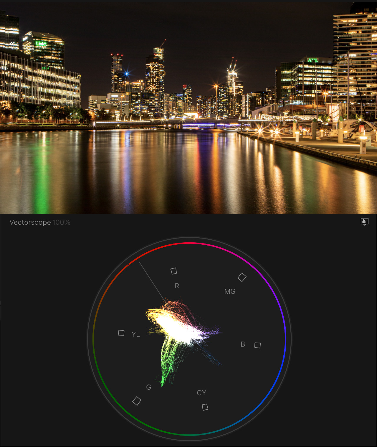
Compare the first example to this one. See how saturated the colors are with clumps around green (lights on the left), orange (building and street lights), blue (spotlight on top of middle building), and magenta (horizontal lights in center of frame).
Again, we can see those color values are there but the vectorscope does not indicate where those colors are located in the frame.
NOTE: Though these colors are much more saturated, they don’t go outside the boundaries indicated by the color targets.

Look how the vectorscope reflects the intense color saturation of these black-eyed susans – almost to the saturation limit. The green foliage, though much more dominant in the shot, is nowhere near as saturated.
Remember, saturation is the intensity of a color. Green leaves are green, but not an intense, saturated green.
THE MAGIC OF MEASURING SKIN TONES

Skin tones (skin “color”) are fascinating to me. If we met this woman on the street, we might say she is “white.” But, she isn’t white. Her sweater is white (red arrows), her top is black (blue arrows). But her skin? That’s a mid-tone gray; around 50%.

When we look at this same image on the vectorscope, we see a strong spike of color directly on the skin tone line, plus smaller bumps for the blue sky and green grass.
This skin tone line is really helpful, because regardless of ethnic group, that which gives our skin color is the red blood pulsing underneath it.
Here’s the secret: skin doesn’t have a color! As you know from getting cleaned up in the morning, dead skin is, essentially, shades of translucent gray. What gives us color is not our skin, but the red blood under our skin. And all of us have the same color blood. Skin determines our gray-scale value, but blood determines our color. The “skin tone line” represents the color of “red-blood-under-skin.”

Here’s a more dramatic example. Three different racial types, with three different grayscale values: around 35%, 50% and 70%.

But look at the vectorscope, they are all hovering near the skin tone line. The color is the same, but the grayscale values are different.

Here, I cropped the image to just include faces. Look at the skin tone line – all the same and directly on the skin tone line! There are no “white” people, there are no “black” people – we are all “mid-tone gray” people.
The reason I stress this is that, if you are looking to make your on-camera talent look normal, they should be on or very close to the skin tone line.
SUMMARY
Video scopes enable us to analyze our images, fix problems, match colors and enhance our scenes. The key is to know the strengths of each scope and what it can tell us; then use them to help us figure out what’s wrong with our images so we can make them look great.
Like many of the finer points of editing, reading scopes takes practice to accurately understand what they are showing. But the time you spend will help you improve the look of every image you edit.
EXTRA CREDIT
Here’s a table, developed by Alexis Van Hurkman for his Encyclopedia of Color Correction, that I’ve summarized for this article.
| Skin Type | Gray-Scale | Color Value |
|---|---|---|
| Female Caucasian | 50 – 70% | On to 2° above skin tone line |
| Male Caucasian | 45 – 65% | On to 2° above skin tone line |
| Female Asian | 40 – 60% | On to 2° below skin tone line |
| Male Asian | 35 – 50% | On to 2° below skin tone line |
| Female Hispanic | 35 – 50% | On to 2° above skin tone line |
| Male Hispanic | 35 – 50% | On to 2° above skin tone line |
| Female Black | 15 – 35% | On to 2° above skin tone line |
| Male Black | 15 – 35% | On to 2° above skin tone line |
5 Responses to Learn How to Read Video Scopes
Awesome, comprehensive article. Thanks, Larry.
Dennis:
I’m glad you liked it. Thanks!
Larry
Color grading/vector scopes/waveforms etc. have sort of been these elusive areas in video editing that I just couldn’t quite grasp completely.
At least now when I’m experimenting I feel like I might actually understand what’s happening…rather than just guessing based on how I think it looks!
Thank you so much for another valuable article.
Sandee:
You are not alone in being confused – it’s a complex subject. I’ve written lots and lots of tutorials on this subject. Here are three you might find helpful:
https://larryjordan.com/articles/two-quick-color-correction-tricks-in-final-cut-pro/
https://larryjordan.com/articles/understanding-raw-hdr-log-lut-and-10-bit-media/
https://larryjordan.com/articles/the-three-rules-of-color-correction-regardless-of-nle-v/
Larry
[…] by Larry Jordan […]