 Joel asked: “I have a text logo onscreen, over top of the intro video. I want the logo to enlarge, eventually getting to the point where a single letter fills the screen, and at the same time, the logo area gradually becomes the concert video. How do I do this? Do I need to use a green-screen?”
This is a fun question, because there are multiple ways to solve this, from very simple to more complex. Let me illustrate three options.
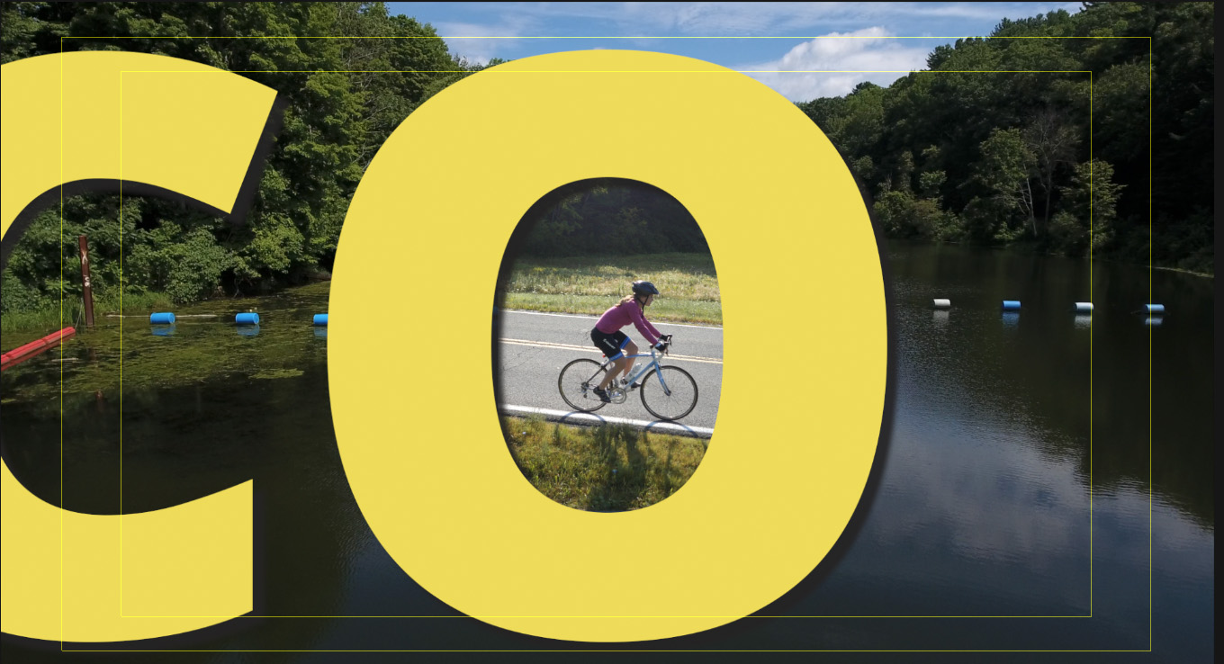
Here’s where we are going… ultimately.
BASIC ASSUMPTIONS
Let’s assume:
In order to zoom into a logo – or any other still object – the resolution of the logo needs to be greater than the frame size of the video project. At a minimum 2X. Ideally, 3X. A high-res logo is critically important.
So, in Photoshop – or any other image editing program – I created a logo which is 3840 x 3840 (lower red arrow). It has two layers:
It is essential that the area outside the logo be transparent. The interior of the logo can be filled, but not if you want to see video under it.
NOTE: In order to see the drop shadow in Final Cut, you need to rasterize the text layer in Photoshop.
SET UP THE LOGO
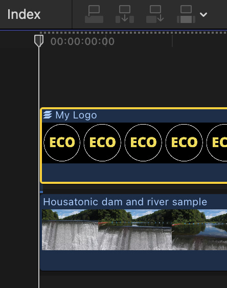
In Final Cut – though this effect works in any NLE – put the background video on the bottom layer. Then, import the Photoshop file and add it to a higher layer.
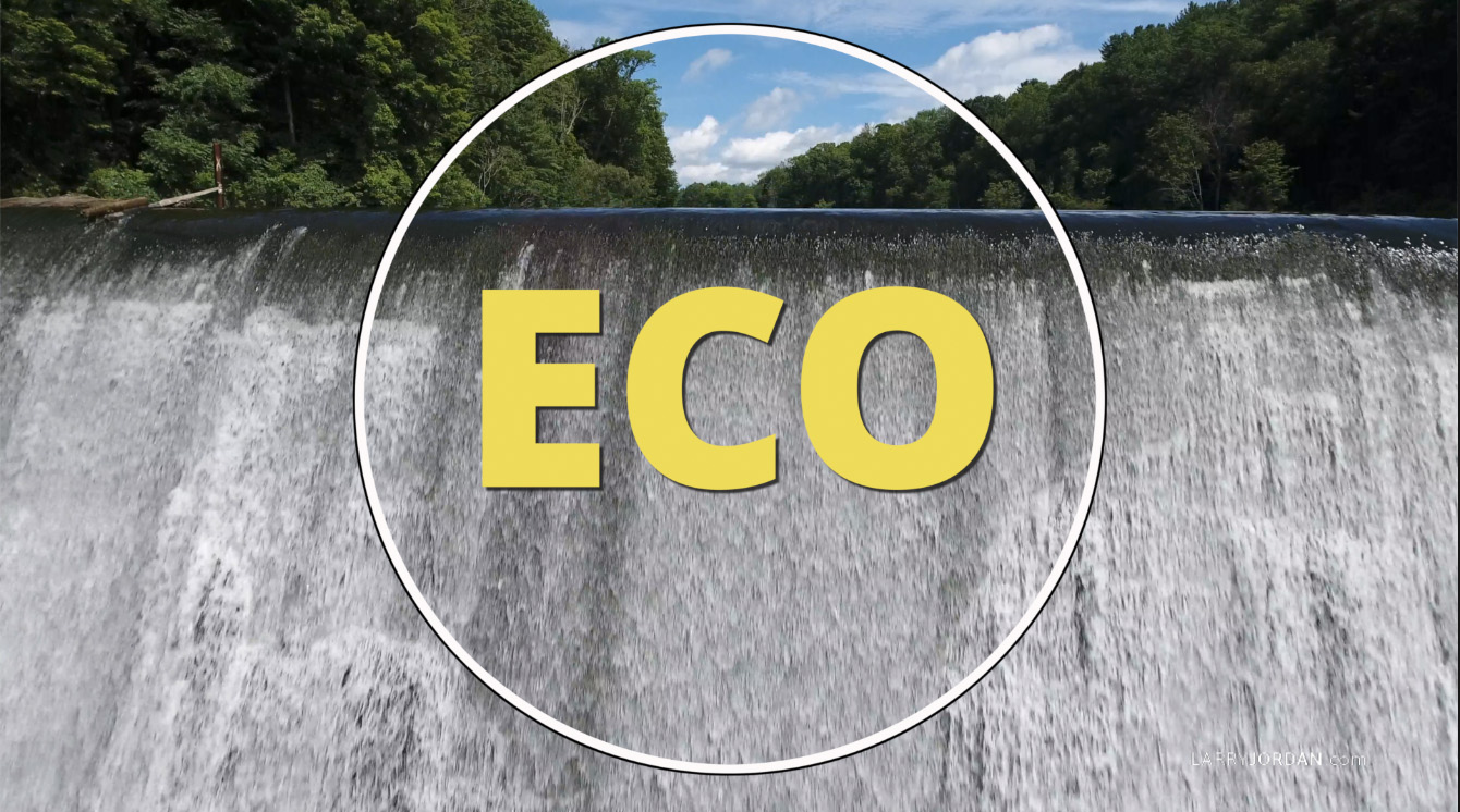
Because both the background and mid-ground are transparent, the logo automatically superimposes over the background video.
NOTE: For best results, select the logo and set Video Inspector > Spatial Conform to None. Then, adjust Transform > Scale to properly frame the logo. In my example, I set Scale to 25%.
Make any necessary Transform > Position adjustments to center the logo in the frame.
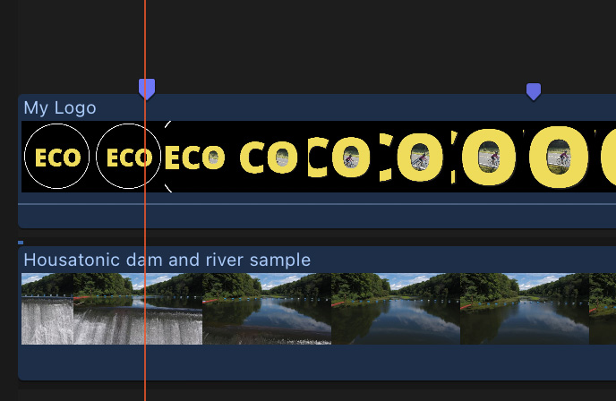
Set markers on the logo (shortcut: M) to indicate where the zoom starts and ends.
At the first marker, set keyframes for Transform > Position and Transform > Scale in the Video Inspector.
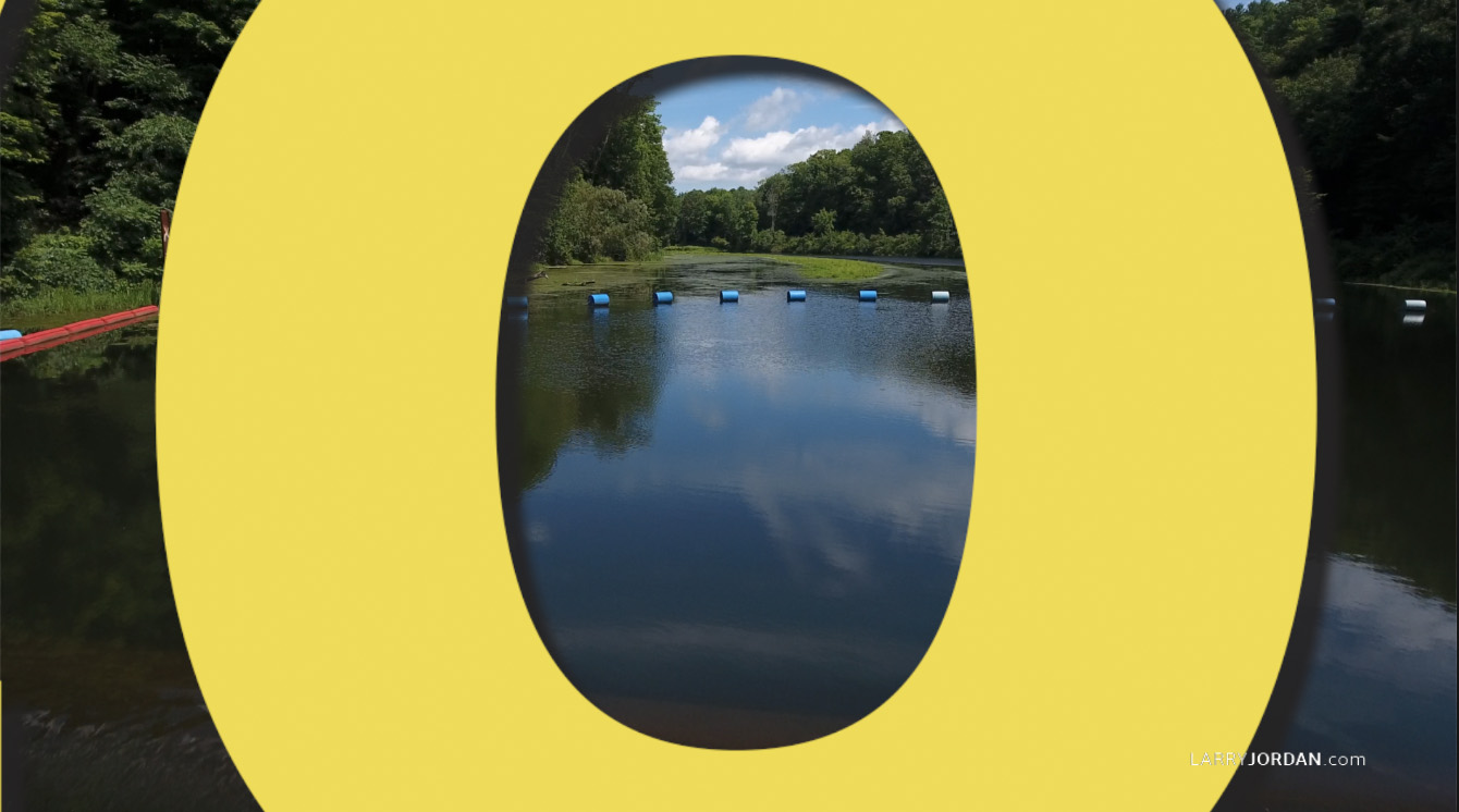
At the second marker, zoom and scale the logo to view the area in which you want the second video to appear.
NOTE: This scaling is why we need a high-resolution logo. The more you scale a logo over 100%, the blurrier it gets. To create this effect, I needed to scale it 200%. Your numbers will vary.
Now that the logo is set – because we use this move for all versions – let’s look at how to reveal the second video.
NOTE: You will get smoother moves if you move the anchor point to center over the letter you are zooming into. Read Final Cut’s Help Files to learn how.
OPTION 1 – QUICK AND SIMPLE
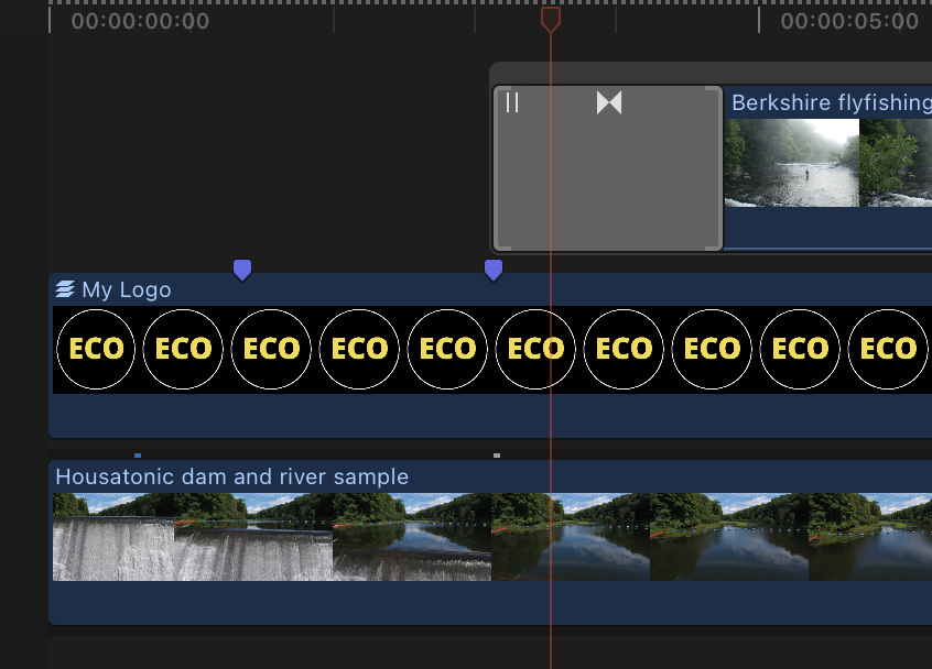
Put the insert video on the highest layer, positioned where you want it to first appear.
Drag a circle wipe on top of the leading edge of this new video clip. Put the playhead in the middle of the wipe.
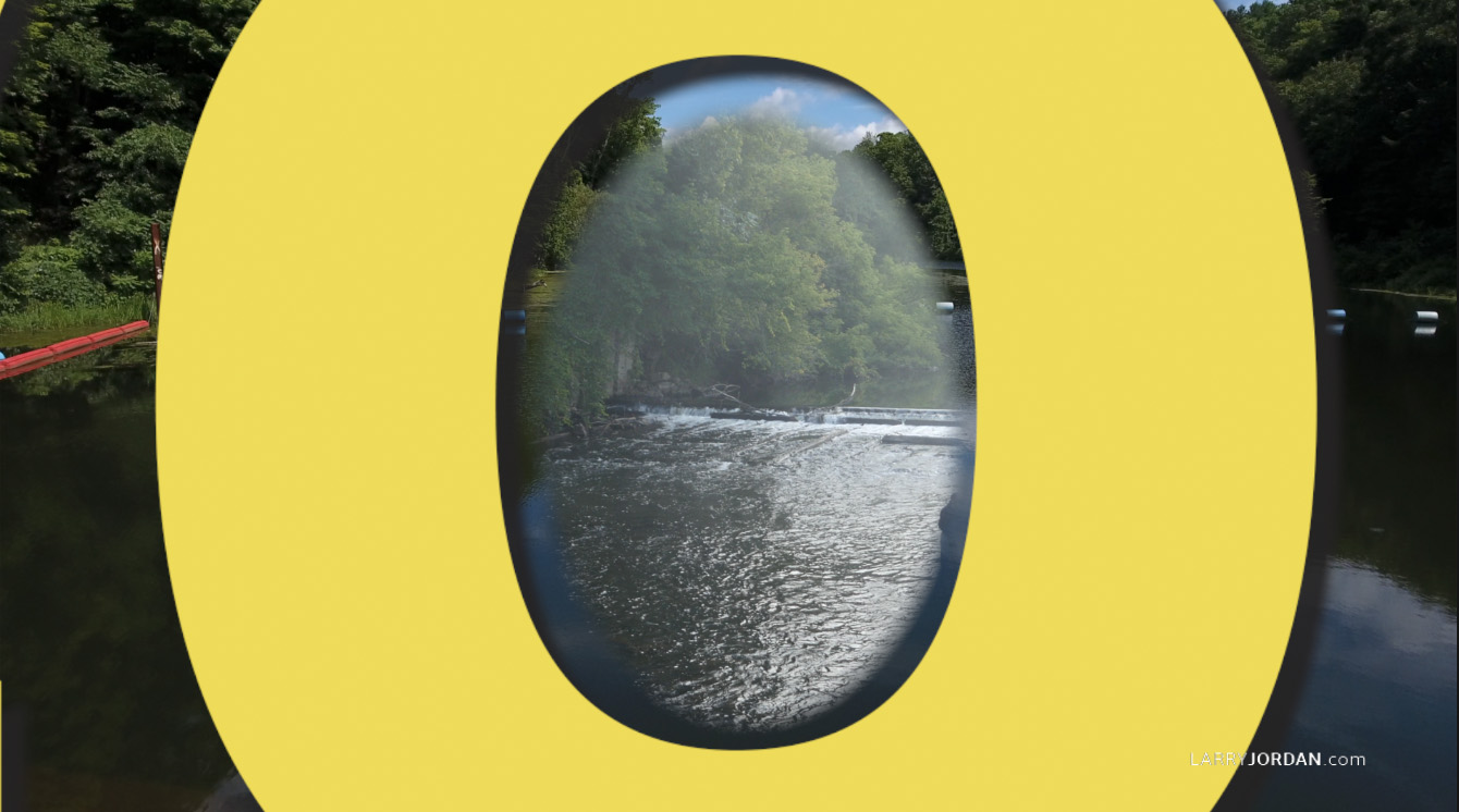
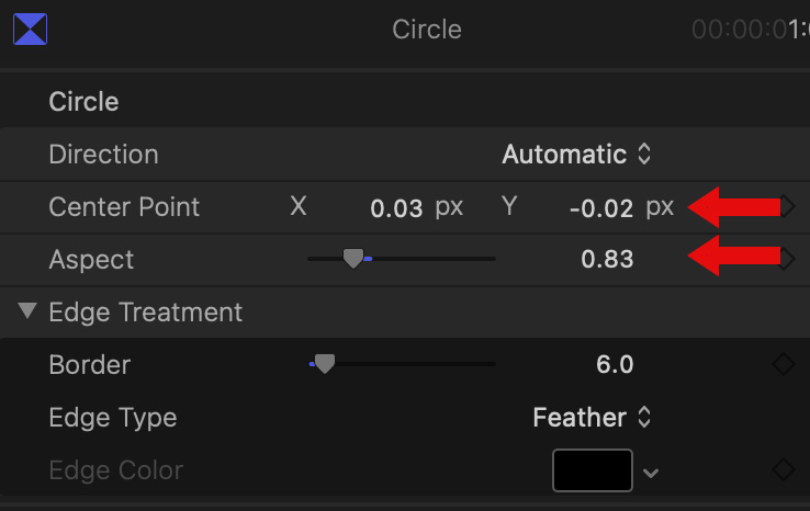
In the Transition Inspector, adjust Aspect and Center point so that the wipe appears out of the center of the letter.
Drag the duration of the wipe to something that looks good to you.
Done.
OPTION 2 – SIMPLE, BUT WITH MORE CONTROL
The nice thing about the wipe is that it is easy to do. But, we have no real control over timing. And we definitely can’t pause in the middle. So, let’s try this.
Delete the wipe transition from the earlier example.
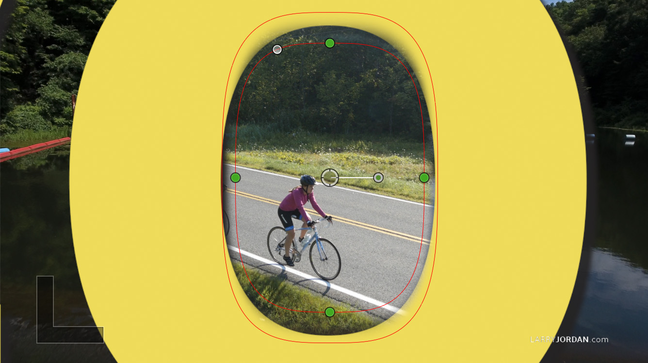
Apply Effects > Masks and Keying > Shape Mask to the insert clip and position it over the area you want the video to appear. A little bit of feathering helps smooth rough edges.
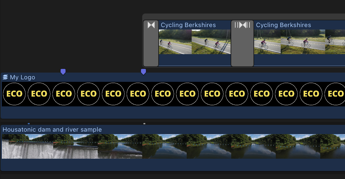
Apply a short dissolve at the beginning of the top layer video to transition into the effect.
Then, cut the top clip where you want it to go full screen and remove the shape mask from the downstream section.
Then apply either:
You can adjust how long the clip stays inside the letter by adjusting the duration before the dissolve/wipe. It’s a few extra steps, but looks better than Option 1.
OPTION 3 – TRICKIER, BUT LOOKS WAY BETTER
The good news about those first two effects is that they are relatively easy to create. The bad news is that you need to wait until the logo zoom is complete before you show the new video. And, we lose the depth provided by a drop shadow around the text. And, well, we can’t get a perfect match to the edges of the text.
Here’s my preferred option – but it will take a bit longer. Remove the top layer video from the timeline.
Open the logo in Photoshop and add a solid color where you want the insert video to appear. This does not need to be a precise fit, and the color is not important. Just be sure the color is at the bottom on its own layer in Photoshop.
Import that revised logo into Final Cut and edit it into the timeline.
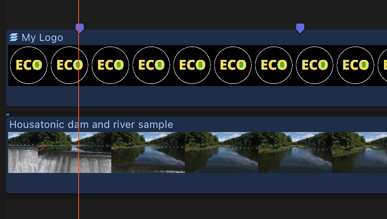
As before, add markers indicating where the zoom effect will start and stop. (This isn’t required but helps make sure all keyframes are in the right spot.)
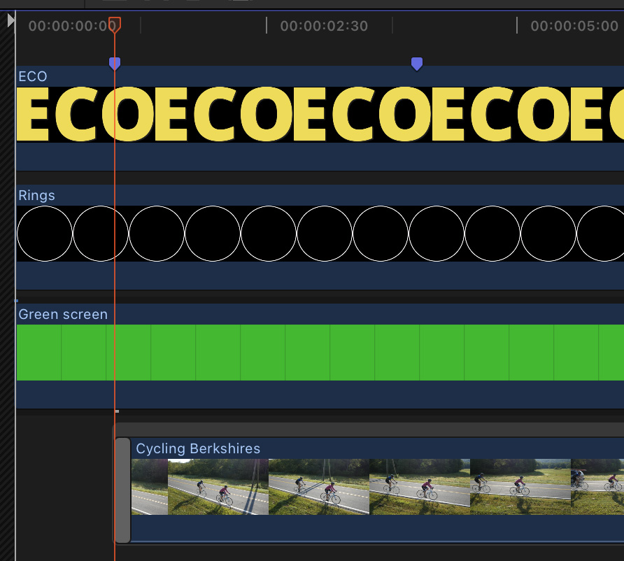
Select the Photoshop clip in the Timeline and choose Clip > Open Clip. This opens it into the timeline to reveal all the layers. Add the insert clip at the bottom, positioned where you want it to start. (In my example, I revealed it right at the start of the zoom.)
Add a short dissolve at the beginning to have it fade into the letter “O”.
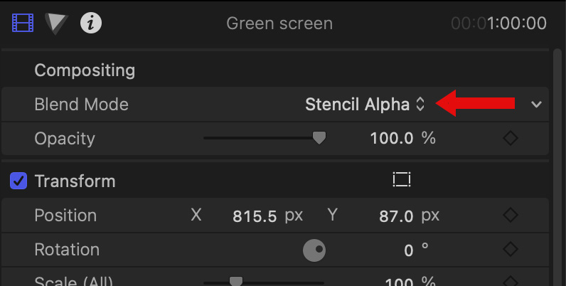
Select the green clip and change its Blend Mode to Stencil Alpha. This is not a chroma-key, rather it simply makes that shape transparent. Since the edges are hidden by the letter “O,” the size and shape of the green square don’t matter.
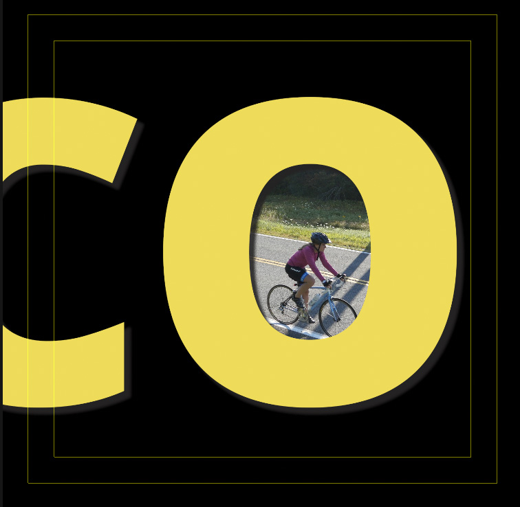
Instantly, the clip is inserted into the green clip, while retaining all drop shadows and other effects. Notice how it precisely fits inside the letter!

To exit the open clip, click the “Go Back” chevron at the top of the timeline (red arrow).
NOTE: Remember, the color of the green clip is not important. What IS important is its shape, its location and that it is on its own layer below all other layers except the insert video.

To animate the zoom, you have two options:
Option two takes a bit more time and requires tweaking, but it creates the best look.
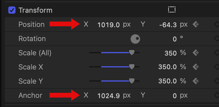
As we learned in the beginning, be sure to change the position of the anchor point for all zooming layers so they look centered. Here are my numbers. You’ll need to reposition each layer after changing the anchor point.
NOTE: Because the insert video is at a difference scale, due to the graphic, it is best to transition to another shot when you decide to go full screen.
SUMMARY
There are lots of ways to create this effect. But they all start with a high-resolution logo.
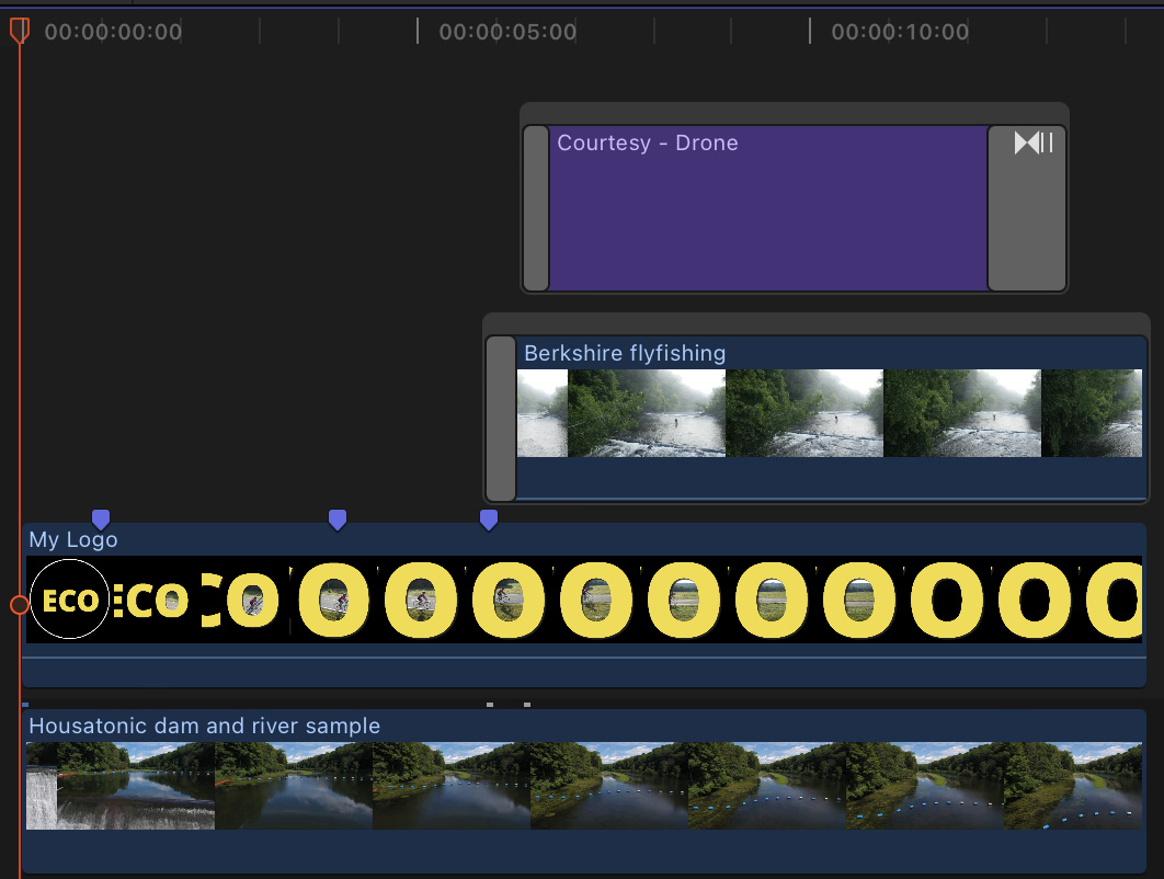
Here’s finished sequence in Option 3. And here are examples of each option:
2 Responses to Animate Video Inside a Logo in Final Cut Pro
Thanks Larry for all of your effort in producing a valuable tutorial. When I usually see this type of effect, the letter continues to zoom until the video inside becomes full screen. I’m sure this is the most complex version, but I believe really sells the effect! Thank you
Richard
Richard:
Easy to do. Just keep zooming and set the second keyframe at the point the letter fills the frame. I did it this way to make it easier to understand the tutorial.
Larry