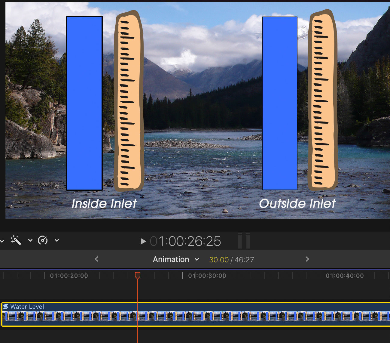
 A week ago, Tony sent me an interesting puzzle:
“I am making a video which illustrates the differences and rates at which the tide rises and falls outside a narrow inlet compared to what is happening inside that inlet. I envisage showing two columns: one for outside and one for inside and show something representing water rising and falling within these columns. I don’t know how to animate such a thing.”
I love challenges like this, but I was buried in other projects and couldn’t turn to it immediately. Still, his question kept springing into my mind, along with multiple possible ways to solve it.
Multiple graphics? Chroma-key? Cell animation? All good alternatives, but it wasn’t until today that I could sit down at the computer to figure it out.
At which point, a quote from Albert Einstein popped into my head: “Make things as simple as possible, but no simpler.” I realized the solution was easy if you thought about it as a problem of graphics, not video.
NOTE: Here’s a tutorial that explains how to do this in Adobe Premiere Pro.

Here’s the finished result. The blue bars indicate the level of water inside an inlet vs. outside the inlet as the tide rolls in. Each blue bar can be animated separately at whatever speed is needed. Best of all, this effect is NLE independent. Virtually any software that can edit video can create this effect.
NOTE: Hydrology is not my speciality. Nor is designing art work. All images can be replaced by something more appropriate.
THE SECRET
The secret is that this entire image is created as a multi-layer graphic in Photoshop, or the image editing software of your choice. Then, the animation is created in Final Cut. No chroma key needed.
CREATE THE GRAPHIC
The final image created in Photoshop consists of seven layers. Then, just to show off, I added a drop shadow to the text and bundled the graphics into two groups. While the groups help in positioning elements in Photoshop, they are ignored when importing the graphic into Final Cut Pro. Drop shadows are ignored by Final Cut as well.
NOTE: While I’m using Photoshop, these same steps apply to whatever image editing software you are using.

NOTE: You could also leave this layer blank to key the animation into video in Final Cut if you choose. A blank base layer creates an alpha (transparency) channel that FCP will use to superimpose the animation into existing video.

NOTE: The drop shadow is optional. FCP won’t import it. If you need a drop shadow on the text, add it to that layer inside Final Cut using the Drop Shadow effect.


Here’s what the Layers menu looks like. However, because none of these elements overlap, the actual stacking order doesn’t make any difference.
I prefer labeling layers and organizing them because if/when I go back to modify the graphic I have a better chance of understanding what I did the first time.
Save the Photoshop file as a Photoshop document (.PSD). The hard part is done. Animation is next.
ANIMATE THE GRAPHIC IN FINAL CUT PRO
Before you create the animation, listen to the sound track and determine the timing of where you want the levels to change. You won’t be able to listen to the sound track while setting the animation, you’ll need to do it by timecode reference.


NOTE: This is called “opening the document into the timeline. Here you are editing the individual layers of the Photoshop graphic inside the graphic. It’s a special form of timeline editing because it only shows this one element.

NOTE: Keyframes are applied to specific frames for specific settings. If a keyframe exists for that setting on the frame the playhead is parked on, the diamond is gold. If it doesn’t, it’s gray

NOTE: To change a keyframe setting, drag the Top slider to a new position. To delete a keyframe, click the gold diamond. To jump between keyframes, click the gray left / right arrows to the left of the gold diamond.
REPEAT AS NECESSARY

Because these are two separate layers, repeat this process for the second bar. Because they are independent, the movement of one bar won’t affect the movement of the other.

To close the Photoshop graphic and return to the normal timeline, click the “go back” arrow to the left of the project name, or open any other project into the timeline.
SUMMARY
You can add as many flourishes to this as you want. Add arrows, animated text, drop shadows, replace the background with video, add new graphics, whatever helps you tell the story.
But the basic procedure remains the same. Create the foreground animation as layers in Photoshop and use keyframes applied to the Crop > Trim command to reveal that which needs to be revealed.
It’s easy – once you know how.